


Works #721
HoppinessRealized


Estudio Montevideo
| Location | Córdoba, Argentina |
|---|---|
| Year | 2020 |
| Categories | Interior Design > Commercial buildings |
Description Original Language (Spanish)
80s foodporn & happiness club; The new version of ourselves. What you wanted us to be. Your happy hour. Your allowed. Your celebration. A club of friends looking for friends.
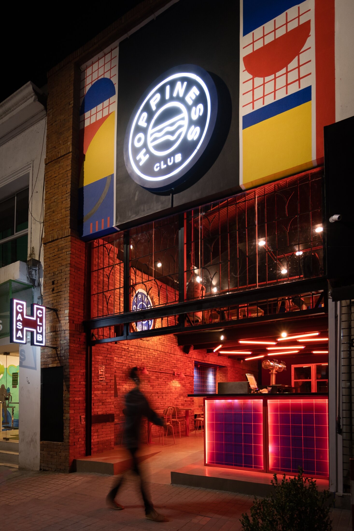
The concept and personality of Hoppiness was based on the 80's, with its vibrant colors and quirky geometries, the pornfood and the rebelliousness of the time.
They asked us for a restyling for a commercial premises that began as a brewery and the public was choosing it for its hamburgers. What generated the need to give a functional and aesthetic twist to the place. That public became so assiduous of the place that it began to function as a club of friends.
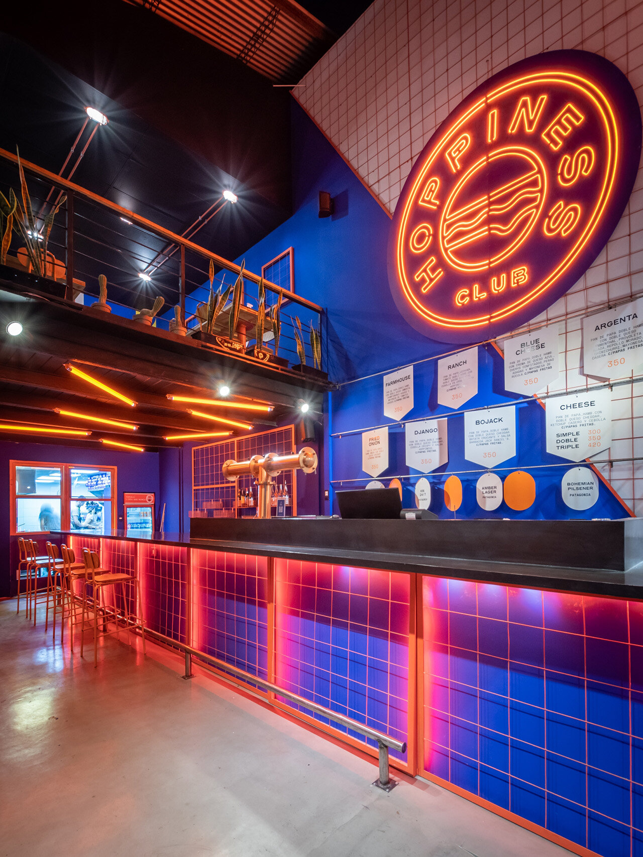
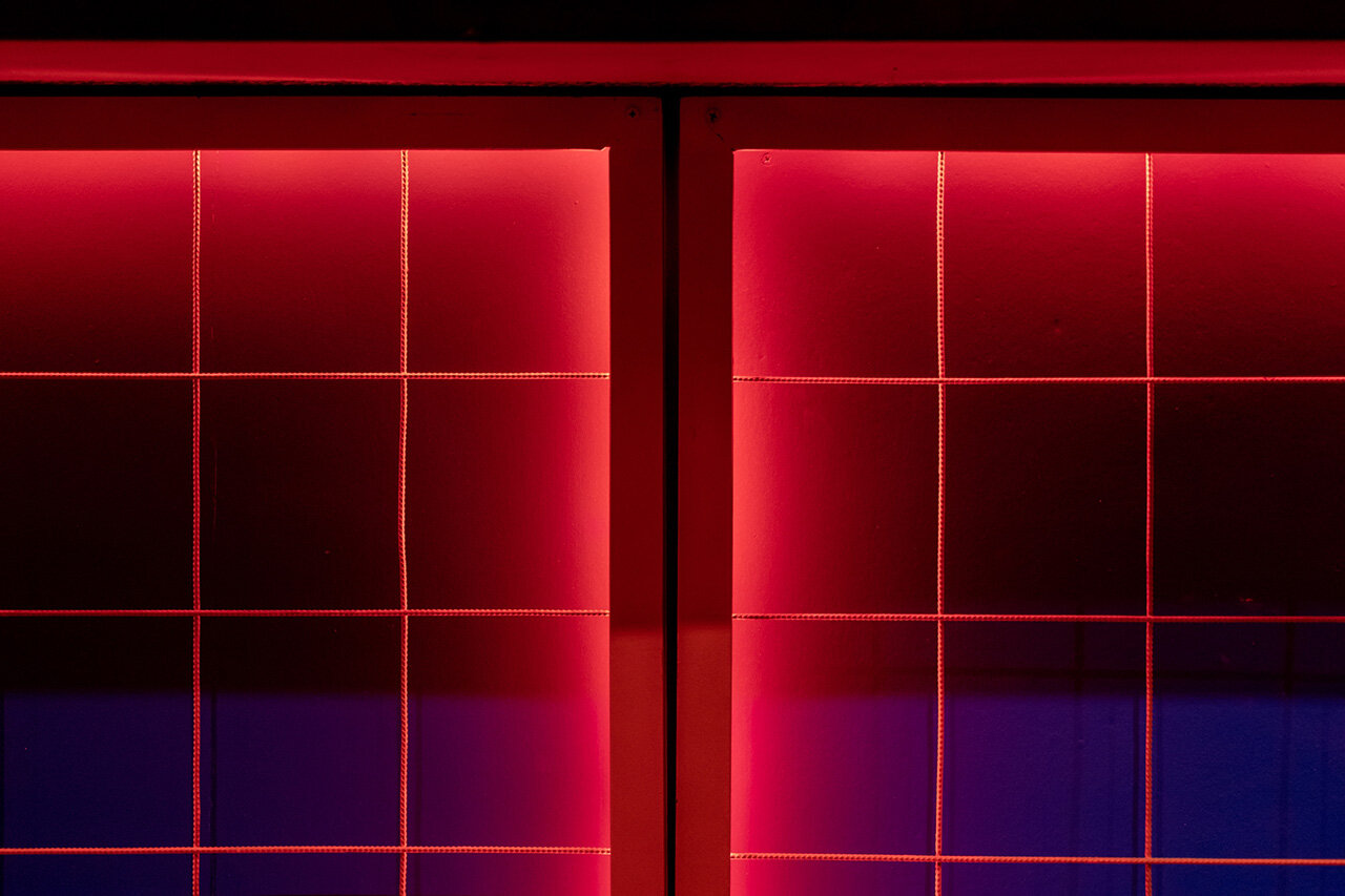
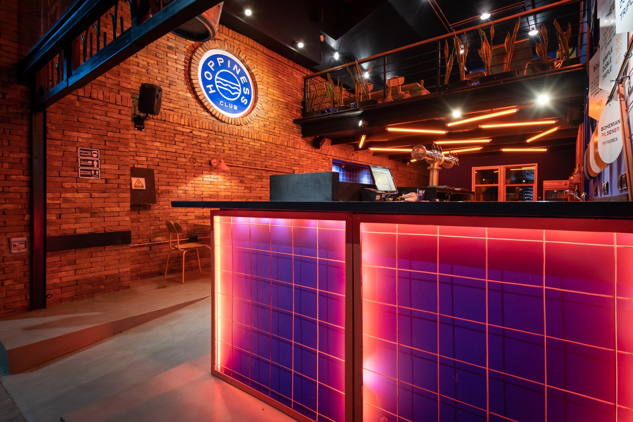
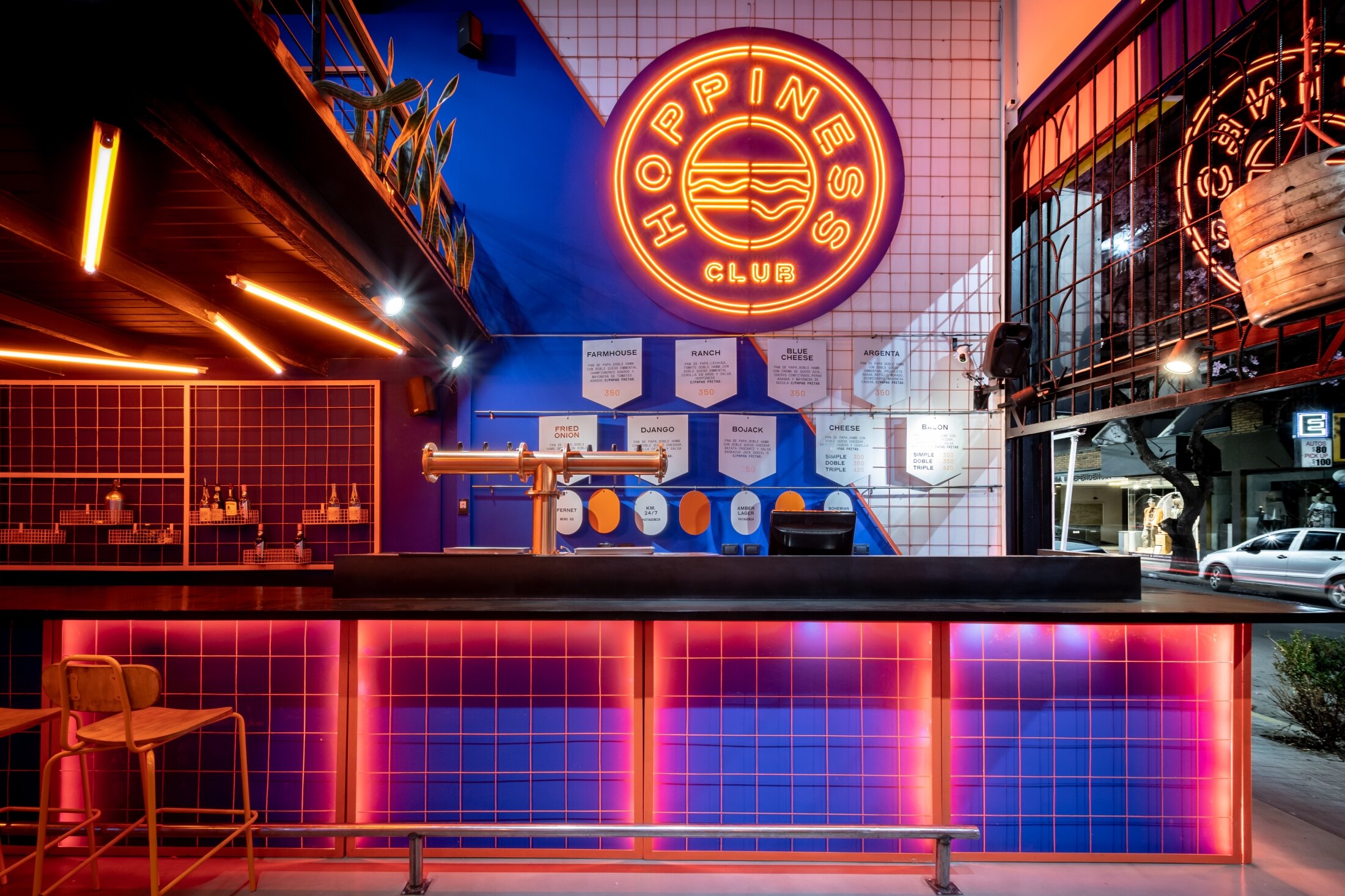
To give greater strength to the club idea, we chose the colors that would represent it from now on. The blue and the orange. The latter applied to materials such as pipes and meshes. Instead, the blue in full as the walls and large surfaces.
The premises are partially opened by a liftgate and a sliding roof that creates an entrance patio. In the background it has a covered area and a high floor that overlooks the patio.
With only 80m2 of living room, we seek to highlight the importance of good service and invite the client to gather around a large bar, which goes from the sidewalk to the kitchen located at the back of the premises.
The fact that the bar reaches the line of the sidewalk is due to the fact that the place works with a very important and developed take away service.
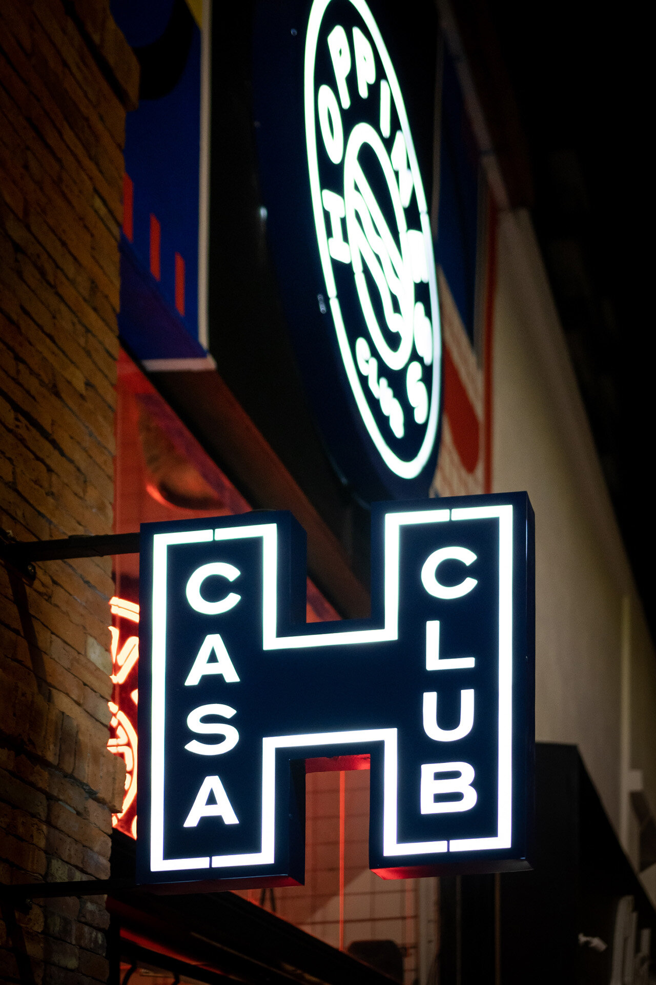
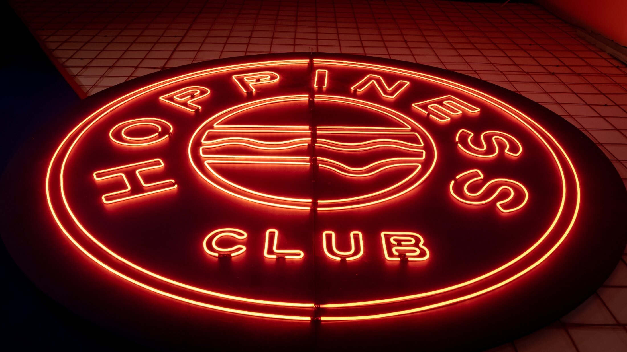
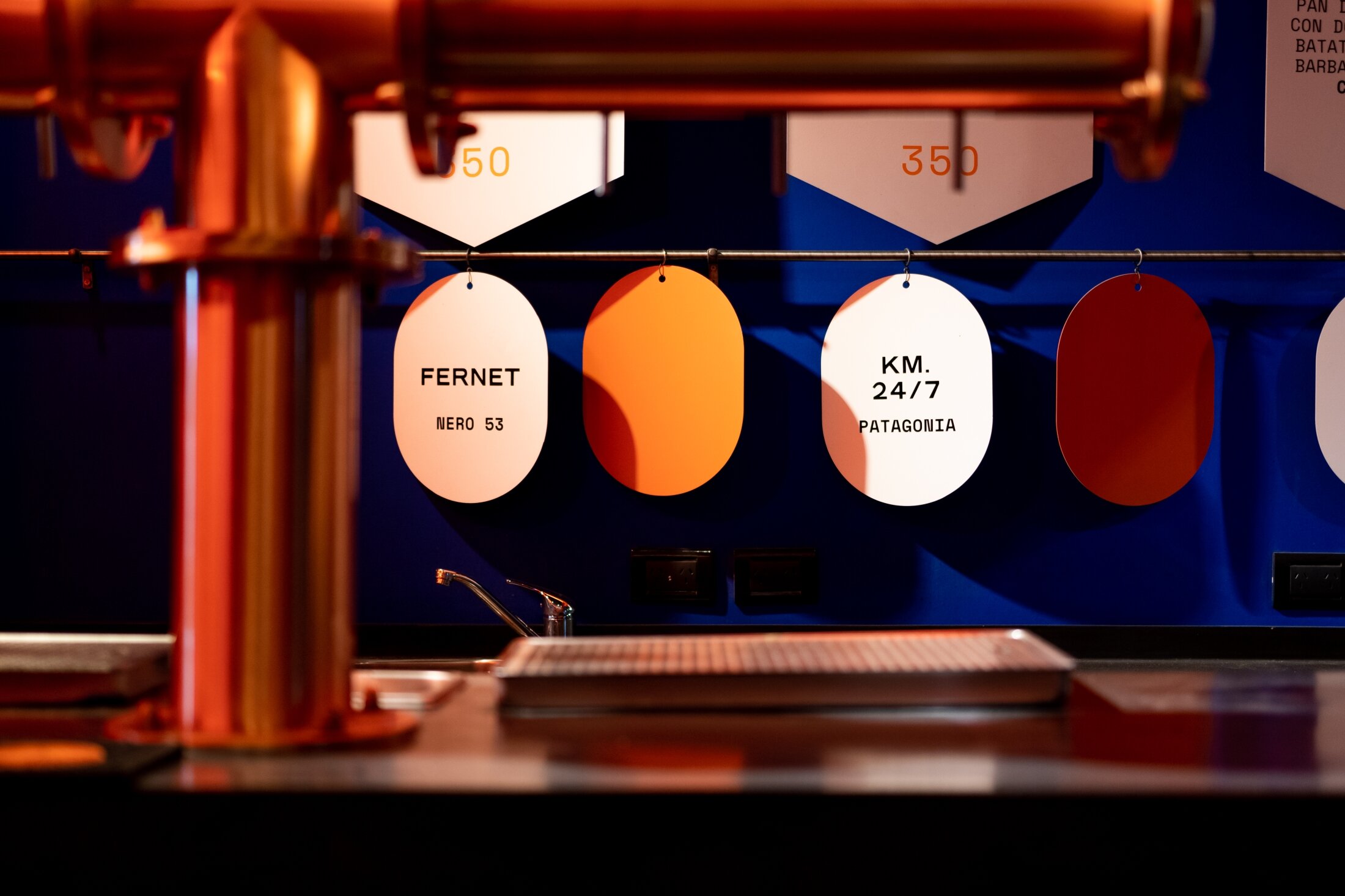
The wall behind the bar is divided in two by a diagonal that divides a lattice of orange mesh and a full blue. Right in the center a neon sign draws attention from all perspectives.
The façade, patio and upper floor are intervened by murals specifically designed with the new branding image that was developed for the place. With geometric figures, which represent the different products they sell.
The orange lighting designed with tubes, neon and led strips, finish giving it the atmosphere of a friend's club that we wanted to achieve.
The words that always resonated in the development of the project were to open, invite, surprise and accompany the client in a new experience in an already known but renewed place.